Mobile-first design is easy to misunderstand.
It does not mean building a desktop website, squeezing the columns until they fit on a phone and calling the result responsive. It does not mean removing useful information because the screen is small. And it certainly does not mean that desktop visitors no longer matter.
Mobile-first design begins with a more practical question: what does a customer need to see and do when there is room for only one clear idea at a time?
For a service business, that answer is rarely complicated. The visitor wants to confirm the service, judge whether the company feels credible, check the location or service area and take a next step. That step may be a call, booking, quote request, consultation or directions tap.
The difficulty is making that path feel obvious without turning the page into one large button.
A strong mobile website helps the visitor move. A weak one asks them to close pop-ups, decipher a vague headline, wait for oversized images and hunt for contact information. The business may never know the visitor was interested. It sees only another short session in analytics.
That is why mobile-first design matters. It is not a design trend. For many local and appointment-based businesses, it is the difference between having a website that technically fits a phone and having one that works when a customer is ready to act.
What mobile-first design actually means
A mobile-first project starts with the smallest common viewport and establishes the essential experience there. The layout then expands for tablets, laptops and larger screens.
That sequence forces useful decisions early:
- Which message belongs at the top?
- What is the primary action?
- Which proof reduces hesitation?
- What information can wait until later?
- How should navigation work with one hand?
- Can the form be completed without zooming?
- Will the booking system still feel like part of the same journey?
- What must load immediately, and what can load later?
Desktop-first design can postpone those questions. There is enough space for several messages, a large navigation menu, multiple buttons, decorative video and a row of trust badges. When the same page reaches a phone, everything competes for a narrow vertical strip.
Mobile-first design begins with priority rather than compression.
Mobile-first design, responsive design and mobile-friendly design are not the same thing
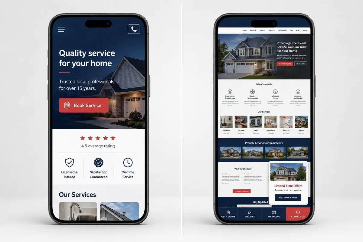
The terms overlap, but they describe different ideas.
| Term | What it usually means | What it does not guarantee |
|---|---|---|
| Mobile-friendly | The page can be viewed and used on a phone | Strong hierarchy, speed or conversions |
| Responsive design | The layout adapts to different screen widths | That mobile priorities guided the design decisions |
| Mobile-first design | The core experience is planned for small screens before expanding | That desktop will be neglected |
A site can be responsive and still feel awkward on mobile. The text may resize correctly while buttons remain cramped. Columns may stack while the least important section appears first. The form may fit the width but still contain 14 unnecessary fields.
Responsiveness is a technical behaviour. Mobile-first is a design and content strategy.
Why service businesses have more at stake with mobile-first design
An editorial website can ask the reader to settle in. A local service website often meets someone in the middle of a task.
The visitor may be:
- standing beside a broken appliance;
- looking for a dentist near work;
- comparing med spa consultations between appointments;
- trying to book a massage on the commute home;
- searching for a contractor from the room that needs repair;
- finding a restaurant while already in the neighbourhood;
- checking whether a clinic is open before making the drive.
This context changes the design.
The visitor may have one hand available, an inconsistent connection and very little patience for discovery. They are not studying the website as a design project. They are asking whether this business can help.
Mobile intent is often practical
Service-business visits frequently lead to actions that are natural on a phone:
- tapping a number;
- opening a map;
- choosing an appointment;
- sending a short enquiry;
- checking hours;
- viewing a service area;
- saving directions;
- reading recent reviews.
These actions should be easy without becoming intrusive. A sticky call or booking button can be useful. Two sticky bars, a chat bubble, a cookie banner and a promotional pop-up can leave almost no space for the content.
Good mobile design respects the task and the screen.
Trust is judged through small details
Customers cannot inspect the full desktop composition on a phone. They make decisions from fragments: the opening statement, image quality, spacing, navigation, reviews, staff profiles and the way the booking process behaves.
A website can feel unreliable because:
- the logo is blurry;
- the heading wraps into an unreadable block;
- buttons shift while the page loads;
- the phone number is not tappable;
- reviews look copied or anonymous;
- service information is thin;
- the footer shows an outdated year or address;
- the form produces an error without explanation;
- the scheduling tool looks unrelated to the business.
None of these problems alone proves that the company is unreliable. Together they create doubt at exactly the wrong time.
Every extra step is more visible
On a desktop, a visitor can scan a wide page and keep several pieces of information in view. On mobile, the next section may be several swipes away. If the page begins with a cinematic video, a long brand statement and three promotional cards, the customer may leave before discovering what the company actually does.
Mobile-first content does not have to be short. It has to be ordered.
Mobile-first design and Google Search
Google uses the mobile version of a site’s content for indexing and ranking. This is known as mobile-first indexing.
The practical consequence is straightforward: the mobile version should contain the same meaningful content, headings, metadata, images and structured information that the business expects Google to understand. Hiding essential service copy from mobile visitors can also hide context from the version Google primarily evaluates.
That does not mean “mobile-first” is one ranking factor that automatically moves a website upward.
Google explains that there is no single page-experience signal. Core Web Vitals are used by its ranking systems, while relevance, content quality and many other signals still matter. A perfect performance score cannot make an irrelevant page useful. A relevant page should not use that fact as permission to deliver a frustrating experience.
For service businesses, mobile SEO and mobile usability tend to support the same goal: help people understand the page and complete the next step.
Core Web Vitals and mobile-first design
Core Web Vitals measure aspects of real-world loading, responsiveness and visual stability. You can read Google’s own breakdown of these metrics on the web.dev Core Web Vitals page.
Google’s current “good” thresholds are:
| Metric | What it measures | Good threshold |
|---|---|---|
| Largest Contentful Paint (LCP) | When the main visible content loads | Within 2.5 seconds |
| Interaction to Next Paint (INP) | How quickly the page responds to interaction | Under 200 milliseconds |
| Cumulative Layout Shift (CLS) | How stable the layout remains while loading | Below 0.1 |
The names sound technical. The user experience is familiar.
Poor LCP is the hero section that remains blank while the largest image downloads. Poor INP is the menu that seems to ignore the first tap. Poor CLS is the booking button that moves just as the visitor tries to press it.
These metrics are useful diagnostic tools, not the full definition of a good mobile website. A fast page with vague copy still fails. A stable page with no visible contact path still loses leads.
What mobile-first design needs on the first screen
The first screen does not need to make the entire sale. It needs to earn the next swipe or tap.
For most service businesses, it should establish four things quickly.
1. What the business does
Avoid opening with a statement that could belong to any company.
“Experience excellence without compromise” may sound polished. It does not tell the visitor whether the business provides cosmetic dentistry, physiotherapy or kitchen renovations.
A useful headline identifies the service or desired outcome in language a customer understands.
2. Where or whom it serves
Location matters for local services. Mention the city, neighbourhood or service area naturally when it affects the decision.
“Emergency Plumbing in Winnipeg” answers more than “Solutions When You Need Them.”
The location should also be consistent with the address, service pages and Google Business Profile.
3. What the visitor should do next
Choose one primary action for the opening screen:
- Book an Appointment;
- Request a Quote;
- Call Now;
- Reserve a Table;
- Schedule a Consultation;
- Check Availability.
Secondary actions can appear, but they should not compete visually with the main goal.
4. Why the visitor should trust the business
Add one concise proof point close to the action. Depending on the business, that might be:
- a genuine review rating;
- years of relevant experience;
- a professional credential;
- a clear warranty;
- the number of local clients served;
- an “accepting new patients” message;
- a realistic response-time expectation.
Use proof that can be verified. A row of generic badges adds decoration, not necessarily confidence.
How mobile-first design improves conversions
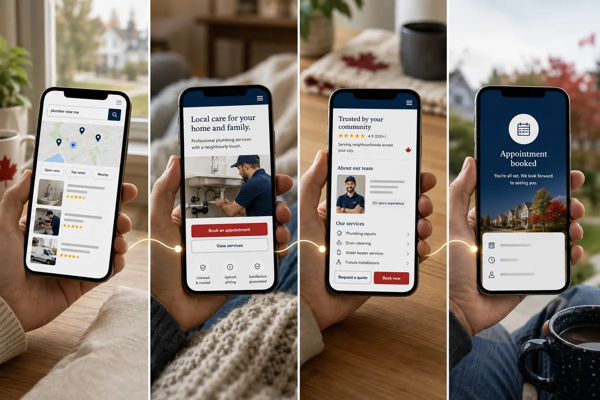
Conversion is not created by a button colour. It is the result of clarity, confidence and low friction.
It makes the primary action visible
Customers should not have to open a menu to discover how to contact the business. Keep the call, booking or quote action visible at appropriate moments throughout the page.
Avoid repeating a button after every paragraph. Repetition works when it follows a decision point: after the service explanation, proof, pricing guidance or frequently asked questions.
It shortens the mental journey
A customer may need detailed information before contacting a clinic, lawyer or contractor. Mobile-first design does not remove that information. It breaks it into a sequence that is easier to understand.
Strong pages move naturally through:
- relevance;
- service explanation;
- proof;
- process;
- practical details;
- action.
This sequence is more helpful than placing every selling point into the hero.
It reduces form abandonment
Mobile forms expose every unnecessary field.
Ask only for the information required for the next step. Use the correct input types for phone numbers, email addresses, dates and numbers so the appropriate keyboard appears. Provide clear labels, useful error messages and a visible confirmation after submission.
Do not use placeholder text as the only label. Once the visitor starts typing, the instruction disappears.
If the business needs a detailed intake, separate the first enquiry from the full onboarding process. A quote request and a construction survey are not always the same form. A clinic appointment request and medical intake should not automatically collect the same information.
It supports phone calls without measuring every tap as a lead
Make phone numbers tappable and easy to find. Then distinguish between a phone-link click and a completed, qualified call in reporting.
A prominent number helps the visitor. Accurate measurement helps the business understand whether the design is producing conversations rather than accidental taps.
Mobile accessibility is part of usability
Small screens make accessibility problems harder to ignore.
Low-contrast text becomes unreadable outdoors. Tiny buttons are difficult for someone holding a phone with one hand. Closely spaced links increase accidental taps. An unlabeled form creates uncertainty for screen-reader users and anyone trying to understand what belongs in the field.
WCAG 2.2’s Level AA criterion for target size uses a minimum of 24 by 24 CSS pixels, with defined exceptions and spacing alternatives. That is a compliance reference, not an ideal size for every primary button. Important actions often benefit from larger, comfortably spaced touch areas.
A mobile-first review should check:
- text contrast;
- font size and line spacing;
- logical heading order;
- meaningful link and button labels;
- keyboard navigation;
- visible focus states;
- form instructions and errors;
- image alternative text;
- touch-target size and spacing;
- behaviour at browser zoom and text enlargement.
Accessibility should be considered during design and development. Adding a widget after launch does not repair an unclear structure or inaccessible booking platform.
Common mobile-first design mistakes on service websites
Shrinking the desktop hero
A wide photograph with text placed over one side may work beautifully on desktop. On mobile, the subject may disappear, the crop may cover the heading and the image may still carry the full desktop file size.
Choose responsive crops and image sizes deliberately. Sometimes the correct mobile asset is a different crop of the same photograph, not an entirely different image.
Letting animation delay the message
Motion can create character. It should not make the visitor wait for the business name, service or contact button to fade into view.
Respect reduced-motion preferences, avoid animating essential information and test performance on an ordinary phone. The design should still make sense when animation does not run.
Using oversized sticky elements
Sticky navigation, chat and booking controls can help. Together they may cover a third of the screen.
Open the page on a small phone and measure the space left after:
- the browser interface;
- website header;
- cookie notice;
- chat widget;
- accessibility control;
- bottom CTA.
The content is the reason the visitor came. Leave room for it.
Hiding useful content on mobile
Removing decorative elements can improve focus. Removing service descriptions, FAQs, practitioner details or location information creates an incomplete page.
Google recommends keeping meaningful content equivalent across mobile and desktop. Use accordions or progressive disclosure when they improve navigation, but do not turn mobile into a thin summary of the real site.
Ignoring third-party tools
The website may be fast until the booking system, map, review feed, chatbot, call tracker and advertising scripts load.
Every tool should justify its weight and behaviour. Delay nonessential scripts, use static previews where appropriate and remove integrations that no longer serve a business purpose.
Testing only in a visual editor
A narrow browser preview is helpful. It is not a real phone.
It may not reveal:
- the on-screen keyboard covering a field;
- a call button that does not open the dialler;
- a sticky element conflicting with the browser controls;
- slow performance on mobile data;
- problems returning from an external booking app;
- autofill errors;
- touch targets that are technically separate but practically difficult to use.
Real-device testing catches the moments that screenshots miss.
Structuring a service page for mobile-first design
A service page does not need a rigid template, but the following order gives the visitor a coherent path.
Opening section
- clear service name;
- relevant location or audience;
- specific primary action;
- concise supporting proof;
- purposeful image or visual.
Problem and fit
Explain who the service is for, what situation it addresses and when another option may be more appropriate. This helps attract better enquiries.
Service details
Describe what is included, how delivery works and what the customer can reasonably expect. Use short sections with informative headings rather than one long wall of text.
Proof
Place relevant reviews, examples, credentials, photographs or case studies close to the claim they support.
Process
Show what happens after contact. A simple three- or four-step process reduces uncertainty and helps the customer understand the commitment.
Cost or planning information
When fixed pricing is not possible, explain what affects the quote, consultation or treatment plan. Silence about cost can drive visitors back to search results. For a real-world breakdown, see how we approach dental practice website cost in Canada.
Frequently asked questions
Answer the questions that genuinely delay action. Avoid adding FAQs only to repeat keywords.
Final action
Restate what the visitor is requesting and what happens next. “Request a quote—we reply within one business day” is more informative than “Submit.”
The technical side of mobile-first design
The largest improvements often come from a few disciplined choices.
Serve correctly sized images
A phone should not download a 3,000-pixel desktop photograph to display it at 360 pixels wide. Use modern formats such as WebP or AVIF where supported, responsive image sources, sensible compression and explicit width and height attributes.
Prioritize the likely LCP image and lazy-load visuals below the fold. Do not lazy-load the main hero image when it needs to appear immediately.
Control fonts
Multiple font families and weights add requests and rendering work. Use the styles the design actually needs, preload cautiously and choose reliable fallbacks.
Typography should remain readable if the custom font is delayed.
Reduce JavaScript work
Menus, sliders, analytics, chat widgets and animation libraries all use the main thread. Remove unused scripts, delay nonessential code and choose simpler interactions when they achieve the same result.
The visitor should not wait for a marketing tool before the booking button responds.
Prevent layout shifts
Reserve space for images, videos, maps and embeds. Avoid inserting banners above visible content after the page starts loading. Load fonts and dynamic elements in a way that preserves the layout.
Stability matters most around interactive elements. A moving button is not only annoying; it can send the visitor to the wrong place.
Build the navigation for thumbs and decisions
Keep the mobile menu concise. Use descriptive labels rather than hiding every service beneath “Solutions.” Make the menu easy to close and maintain a visible route back to the main action.
The best menu is not the one with the fewest items. It is the one that helps people predict where each item goes.
How to test mobile-first design on a service-business website
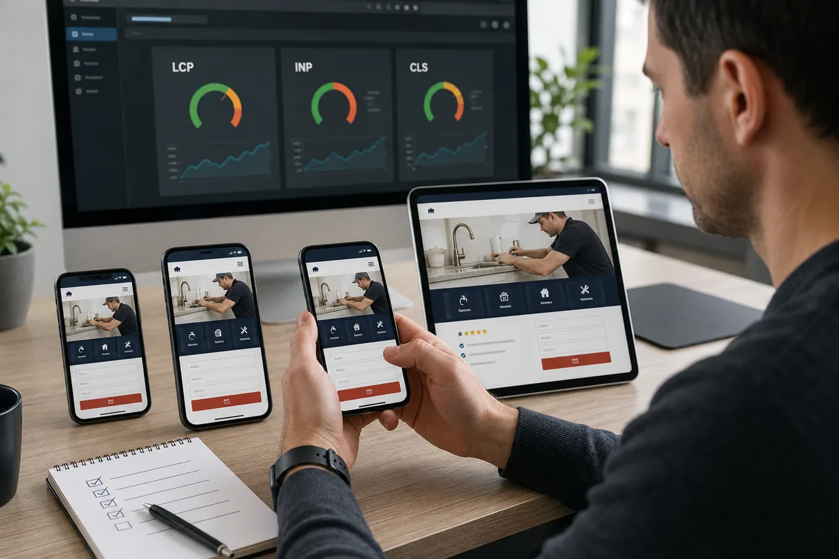
Begin with a real task, not a score.
Ask someone unfamiliar with the site to:
- identify what the business does;
- find whether it serves their location;
- locate a specific service;
- judge whether the company feels credible;
- request a quote or appointment;
- explain what happens next.
Observe where they pause. Do not explain the interface while they use it.
Then test the technical experience:
- common iPhone and Android widths;
- portrait and landscape orientation;
- Chrome and Safari;
- mobile-data conditions;
- navigation and sticky elements;
- every form field and error state;
- click-to-call, map and booking links;
- external scheduling flow;
- keyboard and focus behaviour;
- browser zoom and enlarged text;
- PageSpeed Insights and Lighthouse;
- Search Console Core Web Vitals data.
Laboratory tools simulate conditions and help diagnose problems. Field data shows how real users experienced the site over time. Use both.
Measuring whether mobile-first design is working
Do not evaluate a redesign only by bounce rate or a better speed score.
Track outcomes by device:
- qualified calls;
- quote requests;
- completed forms;
- booking-platform opens;
- confirmed appointments;
- map and direction actions;
- leads accepted by the business;
- cost per qualified mobile lead;
- lead-to-booking or lead-to-sale rate.
Separate intent from completion. A visitor who taps the booking button has not necessarily scheduled. A phone tap is not always a conversation.
Compare meaningful periods before and after the change. Account for seasonality, advertising spend, promotions and traffic-source shifts. If mobile conversion improves while lead quality falls, the design may be encouraging the wrong action or attracting the wrong audience.
Mobile-first design checklist for service businesses
| Area | What to verify |
|---|---|
| Message | The service, location and customer fit are clear on the first screen |
| Primary action | One dominant call, booking or quote action is easy to find |
| Navigation | Labels are descriptive and the menu works comfortably with touch |
| Trust | Relevant reviews, credentials, people and local proof appear near decisions |
| Content | Mobile contains the same essential information as desktop |
| Forms | Fields are necessary, labelled, autofill-friendly and easy to correct |
| Booking | The full journey works across the external platform and confirmation |
| Calls | Phone numbers are tappable and call quality can be measured |
| Speed | LCP, INP and CLS are reviewed with lab and real-user data |
| Images | Responsive sizes, compression, dimensions and loading priorities are correct |
| Accessibility | Contrast, focus, headings, labels and touch targets are checked |
| Overlays | Pop-ups, chat, cookie and sticky controls do not obscure content |
| Analytics | Mobile clicks, leads, bookings and qualified outcomes are distinct events |
| Testing | The site is tested on real phones, not only in the page builder |
Does the business need mobile-first design?
Not every mobile problem requires rebuilding the website.
A focused optimization may be enough when the structure is sound and the issues are isolated: an oversized hero image, weak CTA, awkward form or excessive script.
A redesign becomes more sensible when:
- mobile content is fundamentally different or incomplete;
- the page hierarchy cannot be corrected without rebuilding templates;
- navigation repeatedly blocks important services;
- the site depends on inflexible desktop layouts;
- performance problems come from the underlying theme or platform;
- forms and bookings cannot be tracked reliably;
- accessibility failures are structural;
- the business has changed but the website still reflects the old offer;
- mobile visitors regularly convert at a much lower rate for identifiable usability reasons.
Begin with evidence. Rebuilding a site without understanding the problem can produce a cleaner version of the same conversion path.
Build mobile-first design around the customer
Maple Web Agency builds mobile-first, conversion-focused websites for service businesses in Winnipeg and across Canada, including dental practices, medical clinics, med spas and other appointment- or enquiry-driven companies. See this approach applied in our guide to dental website design in Canada.
Every project begins with the action the business needs customers to take. The sitemap, content hierarchy, mobile interface, call or booking integration, local SEO foundations and analytics are then built around that path.
If you are unsure whether your current website is helping or losing mobile leads, start with a free website audit. We will review the first-screen message, navigation, mobile speed, service pages, calls, forms, booking flow and conversion tracking before recommending a focused improvement or full rebuild.
You can also explore our website design services and current pricing to see how mobile-first planning fits into a complete project.
Frequently asked questions
What is mobile-first design?
Mobile-first web design begins by planning the content, hierarchy, actions and performance for small screens. The experience then expands for tablets and desktops. It is a strategy, not simply a responsive layout.
Is mobile-first design important for SEO?
Yes. Google uses the mobile version of a site’s content for indexing and ranking. Mobile design also affects page experience, content accessibility and Core Web Vitals. It does not replace relevance, quality content or other SEO work.
Is a responsive website automatically mobile-first?
No. Responsive websites adapt to screen widths, but they may still be planned primarily for desktop. A mobile-first site uses mobile constraints to decide content order, navigation, interactions and loading priorities from the beginning.
What should appear first on a service-business mobile homepage?
The opening screen should identify the service, relevant location or audience, primary action and a concise proof point. The visitor should understand what the business does and how to take the next step without opening the menu.
How fast should a mobile website load?
There is no single load-time number that describes the entire experience. For Core Web Vitals, Google recommends LCP within 2.5 seconds, INP below 200 milliseconds and CLS below 0.1. Evaluate these alongside usability and conversion data.
How large should mobile buttons be?
WCAG 2.2’s Level AA target-size criterion uses a minimum of 24 by 24 CSS pixels, with specific exceptions and spacing rules. Important mobile actions often benefit from larger touch areas and generous spacing.
Should mobile pages have less content than desktop pages?
Not necessarily. Remove repetition and decoration when useful, but keep essential services, proof, FAQs and contact information. Organize longer content into clear sections or accordions rather than deleting information customers and search engines need.
How can a service business improve mobile conversions?
Clarify the first screen, make the primary action easy to reach, strengthen relevant proof, simplify forms, test external booking tools, improve speed and measure qualified calls or bookings rather than clicks alone.