If you talk to most dentists about dental website design and marketing, you’ll hear the same frustration:
“They told me my website looked fine, but I’m still not getting new patients.”
That’s the gap this page is about.
A dental website isn’t just a digital brochure anymore. It’s the first place new patients judge your clinic, compare you to the dentist down the street, and decide whether they trust you enough to book. When your site loads slowly, looks dated, or hides key information, people don’t send feedback – they quietly click the next result.
The good news is that dental website design is a problem you can solve once, then benefit from for years. With the right structure, messaging, and technical foundation, your website can become a predictable source of appointments, not just “something your practice is supposed to have.”
Why dental website design is mission‑critical for your clinic
Let’s be blunt: in Canada, most prospective patients type something like “dentist in [city]” on their phone and start scanning results. They don’t know you yet. All they see is:
- A Google Business card
- A star rating
- A website preview
If your dental website design doesn’t immediately answer three basic questions, you lose them:
- Who are you, and what kind of dentistry do you offer?
- Can they trust you with their health, comfort, and money?
- How do they book – right now – without hunting for information?
A well‑designed dental website does that in a few seconds. It feels modern and calm, it’s easy to move around, and it makes booking an appointment feel like a natural next step.
On the other hand, sites built on generic templates or “cheap and cheerful” packages tend to bury what matters: services, pricing signals, insurance, and contact details. They also ignore how real patients behave – especially anxious ones, or people with limited time between work and family.
The result:
Plenty of traffic driven by local search and Google Ads, but a disappointing number of actual calls and online bookings.
Dental website design done properly closes that gap.
What clean, professional design looks like for a dental clinic — dental website design
People often confuse “clean design” with “white background and blue buttons.” That’s not it.
A professional dental website should feel like walking into a well‑run clinic: calm, organised, and reassuring. The visual design is part of your clinical experience, just delivered through a screen.
A few practical markers of that:
- Consistent colour palette that matches your brand, scrubs, logo, and physical space.
- Typography that’s simple and readable, not a mix of fancy scripts and condensed fonts.
- Whitespace around sections, so nothing feels crammed or chaotic.
- Real photos of your team, reception, and operatories – not stock models with unnaturally perfect smiles.
Think about the kind of patients you want to attract. Parents looking for a family dentist in Calgary or Winnipeg are not impressed by a cluttered homepage full of buzzwords. They want to see:
- Friendly faces
- Clear information on kids’ hygiene, check‑ups, and orthodontics
- Insurance and payment options
- Contact details they can tap on mobile
A calm, consistent design helps them absorb all that without effort. You’re not just “making something pretty”; you’re lowering cognitive load so the decision to book feels safe and obvious.
Mobile‑first dental website design and fast loading are non‑negotiable
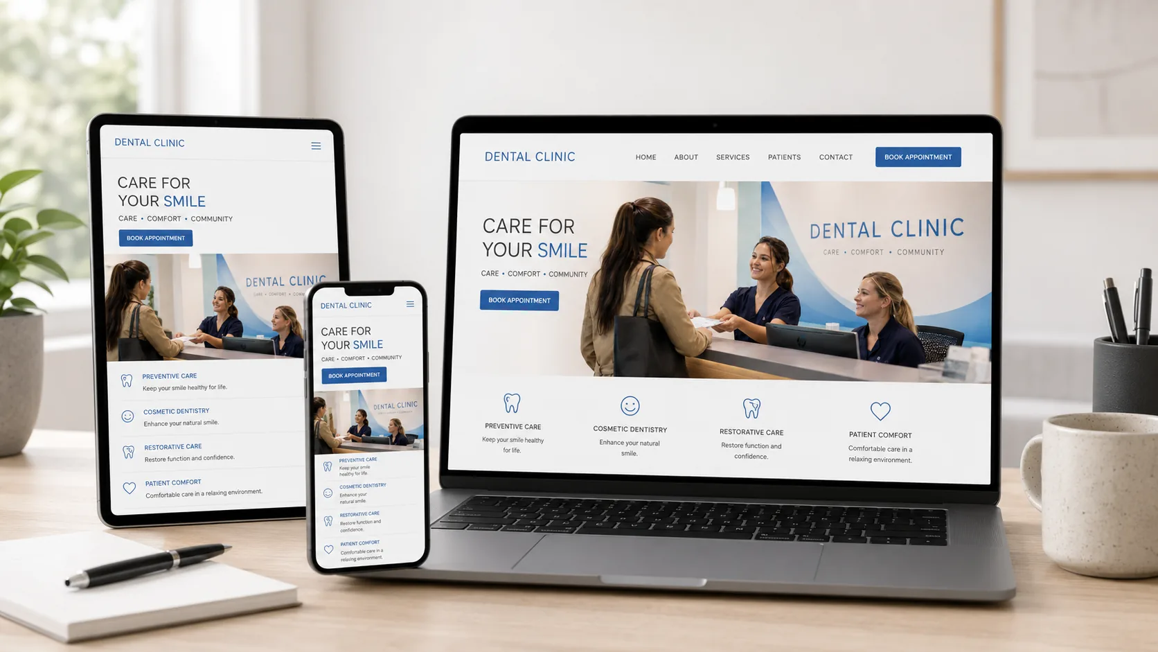
Most Canadian dental searches now happen on phones. That’s not a vague trend – you see it in analytics the moment you look at device breakdowns.
If your website was designed years ago only for desktop, you’ve essentially made life difficult for the majority of your potential patients. Tiny text, microscopic buttons, menus that don’t fit the screen, and hero images that push the content below the fold are all silent conversion killers.
A mobile‑first dental website design solves this directly:
- Layouts are planned on a phone screen first, then expanded to desktop.
- Tap targets (buttons, phone numbers, menu items) are sized for thumbs, not mouse pointers.
- Key sections – services, contact, book now – are just a swipe away.
- Fonts, spacing, and contrast are chosen to be readable even in bright daylight.
We cover this in more depth in our guide on why mobile-first design matters for service businesses.
On top of that, you need fast loading. Not “acceptable,” but fast enough that people don’t abandon the page while they’re standing outside a clinic or looking between meetings.
From a practical standpoint, that means:
- Compressing and properly sizing images, rather than uploading 4000px photos and letting the browser do the work.
- Using modern image formats (like WebP) and lazy loading for less critical visuals.
- Keeping scripts lean – you don’t need five sliders and heavy animation libraries on a dental site.
- Leveraging caching and solid hosting so Time to First Byte stays low.
Tools like Google’s Core Web Vitals give a useful, real-world benchmark for how fast and stable a page feels to visitors.
Even a great message can’t convert if the page takes 5–7 seconds to show anything meaningful. Your website should feel snappy enough that the patient thinks: “Ok, these guys are organised.”
Navigation and user experience: how patients actually move through your site
It’s easy to fall into the trap of designing a site for yourself rather than for a patient. You know every corner of your practice; they don’t. Good dental website design is built around real user journeys.
Most new visitors want to answer four questions:
- What do you treat? (general, cosmetic, implants, emergencies)
- Where are you? (city, neighbourhood, parking, transit)
- When can they come? (hours, availability, emergency options)
- What will it cost / can they use insurance?
If your navigation makes those answers hard to find, they’ll assume you’re hard to deal with in general.
A solid structure usually looks like this:
- Home – quick overview, strongest CTAs
- About – who you are, team, philosophy
- Services – each major service with its own section or page
- New Patients – forms, insurance, financing, FAQs
- Contact / Book – map, directions, phone, online booking
Within each page, headings and internal links guide people forward. You’re intentionally leading them from curiosity to confidence, and then to a clear action. There’s no mystery; the site feels like it was designed by someone who understands how patients think.
Content that answers patient questions instead of repeating clichés
You’ve seen enough generic copy to recognise it instantly:
“At our clinic, we care deeply about your smile. We use state‑of‑the‑art technology and provide personalised care.”
No patient has ever booked an appointment because of phrases like that. Patients book when your content speaks to their real concerns:
- “Will this hurt?”
- “How much will this cost, roughly?”
- “Do they actually listen, or am I just another case?”
- “What happens if something goes wrong?”
Effective dental website content leans into those questions. For each service page – fillings, implants, Invisalign, hygiene, whitening – you explain:
- What the treatment involves, in plain language.
- Who it’s for and who it’s not for.
- What people typically feel during and after.
- How long recovery usually takes.
- Whether insurance commonly covers it.
- What results patients can reasonably expect.
You don’t promise miracles. You describe outcomes in grounded terms, backed by real cases, photos, and reviews. This is where expertise shines through: instead of generic SEO fluff, visitors see that the site reflects a real practice with real experience.
Visuals that support trust, not just decoration
Dental website design lives or dies on visuals. Not because “design trends” demand it, but because dentistry is inherently visual: smiles, equipment, spaces, people.
The way you show those elements matters:
- Team photos that actually look like your team, in your clinic, not in a generic studio.
- Operatories and reception shots that give a sense of the environment patients will walk into.
- Before‑and‑after galleries for relevant treatments, handled with consent and ethical care.
- Short explainer videos for complex procedures, so patients see and hear a real clinician.
Done properly, these visuals reduce anxiety. Patients can imagine themselves in your chair or at your front desk. They see real results, not idealised stock imagery, and that helps them bridge the mental gap between “I need a dentist” and “I’m comfortable choosing this one.”
Clear calls‑to‑action that respect your patients’ time
Many dental sites technically have CTAs, but they’re buried or vague:
- “Learn more”
- “Submit”
- “Click here”
Dental website design that converts is honest about what you want people to do, and it makes that action trivial:
- “Book an appointment”
- “Request a consultation”
- “Call our team”
- “Check availability”
You’re not pushing; you’re offering a straightforward next step. That usually means:
- A strong primary button in the hero section.
- Repeated CTAs at natural breakpoints further down the page.
- A simple, mobile‑friendly form for online bookings or inquiries.
- A phone number that’s clickable and prominent, especially for emergencies.
The important detail is consistency. Each page should have one main CTA that matches the stage of the journey. A detailed implants page, for example, might push people to “Request an implants consultation,” while a general emergency dentistry page prioritises “Call now – we answer after hours.”
Trust signals: reviews, testimonials, and credentials

Dentistry is intimate. People are handing over their health, their appearance, and often a significant amount of money. Of course they want proof you’re not just saying the right things.
Trust on a dental website comes from a few concrete elements:
- Real patient testimonials, with names, short stories, and ideally a photo or video.
- Embedded Google, Yelp, or RateMDs reviews, not copied quotes without source.
- Professional bios for each dentist and hygienist – training, experience, special interests.
- Memberships and certifications, such as provincial dental associations, continuing education, or specific advanced training.
The key isn’t to brag. It’s to give visitors enough information to feel comfortable. When they can see how other patients describe you, and understand who will actually treat them, the decision to book is far less risky.
SEO and local search: helping patients in your city find you
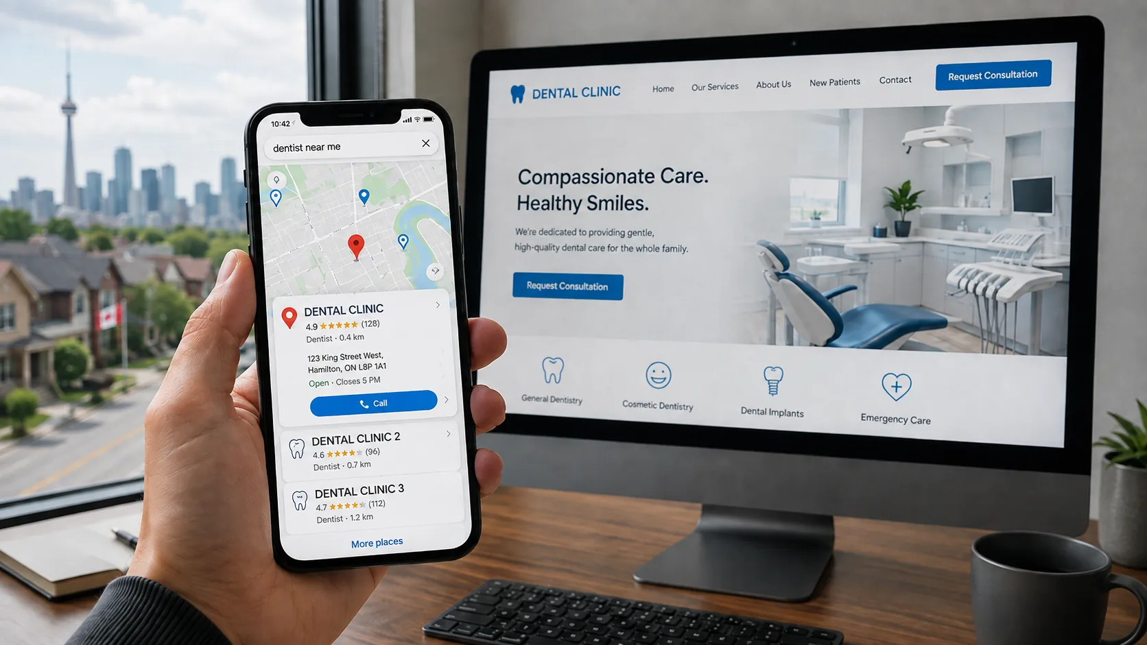
Strong dental website design in Canada needs to be paired with local SEO that gets you in front of the right people. That doesn’t mean stuffing every paragraph with “dentist in [city]” – it means structuring the site so search engines can clearly understand what you offer and where.
In practice, that involves:
- Mapping out primary keywords for each service and location – family dentist, emergency dentist, cosmetic dentist, implants, etc.
- Creating dedicated pages for key treatments and, when helpful, for specific neighbourhoods or cities.
- Writing title tags and meta descriptions that speak to real patient intent, not just robots.
- Ensuring NAP data (name, address, phone) is consistent across your website, Google Business Profile, and directories.
- Using schema markup to help search engines recognise your clinic as a local healthcare provider.
The goal isn’t to win a technical contest. It’s to make sure that when someone types “dentist near me” in your city, you show up with a strong snippet and a website that backs up the promise.
Security, privacy, and accessibility
Patients care a lot less about acronyms than about whether their information and experience are handled properly.
On the technical side, that means:
- Running your site over HTTPS with a valid certificate.
- Being thoughtful about the forms you use, especially if they collect sensitive health information.
- Hosting with providers that take uptime and security seriously.
On the patient side, accessibility matters too, in line with standards like the Web Content Accessibility Guidelines (WCAG). You’re serving people of different ages, abilities, and devices. Practical steps include:
- Clear contrast between text and background.
- Alt text on images that conveys meaning.
- Logical heading structure for screen readers.
- Keyboard‑friendly navigation.
Most patients will never notice these details consciously. They’ll just feel that your site “works” – and that overall impression carries weight when they choose a provider.
Keeping the site alive: content, analytics, and small improvements
A dental website isn’t a one‑and‑done project. Clinics change hours, add new services, bring on new associates, update technology, and refine their approach. Your website needs to reflect that reality.
The clinics that win in search and conversion usually:
- Check analytics periodically to see which pages bring patients and which don’t.
- Add or update content as new services or questions appear.
- Refine CTAs and layout when data shows people are getting stuck.
- Keep blog or article sections focused on genuinely helpful topics, not random filler.
None of this has to be a full‑time job. It’s about treating your dental website as a living part of your practice, not a static brochure that you’ll “fix someday.”
If you’re also weighing the investment side, our breakdown of dental practice website costs in Canada can help you budget accordingly.
A dental website that’s properly designed, written, and maintained does more than look good. It quietly supports your front desk, stabilises your marketing, and gives nervous patients one more reason to trust you.
If your current site feels like it was built for a different clinic or a different era, that’s exactly the kind of problem high‑quality dental website design solves.